How To Organize And Structure Your SASS Code

SASS (Syntactically awesome style sheets) is an extension of the CSS which adds syntactic power to the basic CSS language making it easier for developers to write CSS. It is just a CSS preprocessor so that you can write CSS in an easy and convenient way.

“Sass is a meta-language on top of CSS that’s used to describe the style of a document cleanly and structurally, with more power than flat CSS allows. Sass both provides a simpler, more elegant syntax for CSS and implements various features that are useful for creating manageable style sheets.”

“Sass is an extension of CSS3, adding nested rules, Variables, mixins, selector inheritance, and more. It’s translated to well-formatted, standard CSS using the command line tool or a web-framework plugin.”

It’s Sass, not SASS. Sass doesn’t stand for anything, except maybe making your CSS Sassier. Sass makes CSS sassier because it’s a preprocessor. Preprocessors make writing code easier.

If it helps you make CSS more like a real programming language. If that doesn’t help, just think of it as a way to write CSS that’s cleverer.

The History of SASS:

  • Sass was first given life by Hampton Catlin in 2006, later supported by Natalie Weizenbaum and Chris Epstein
  • Sass started life in the ruby community
  • Sass supports two syntaxes
    –Indentation syntax with file ext .sass
    –CSS compatible syntax with file ext .scss
  • Sass is free to use and requires no license.

Why Use SASS?

  • Modularize (@import)
  • Variables for maintainability
  • Mixins improve reusability
  • Reduces redundant rules (keep it DRY)
  • Scalable and Maintainable
  • Sass is completely compatible with all versions of CSS
  • Sass reduces the repetition of CSS and therefore saves time
  • It provides the document style in a good, structured format, better than vanilla CSS
  • It uses re-usable methods, logic statements, and some of the built-in functions such as color manipulation, mathematics, and parameter lists

SASS and SCSS

Two available syntaxes

SASS

  • HAML-style indentation
  • No brackets or semi-colons, based on indentation
  • Fewer characters to type
  • Enforced conventions/neatness

SCSS

  • Semi-colon and bracket syntax
  • Superset of normal CSS
  • Normal CSS is also valid SCSS
  • Newer and recommended

How to Install SASS on Computer

Install Live SASS Compiler Extension in VS Code

  • Select the Extensions tab from the sidebar. Click on the Extensions tab from the sidebar
  • Search for Live Server in the search box
  • Search for “Live Sass Compiler” from the search box
  • Click on the Install button
  • It  is now in the NodeJS package also
  • First, install NodeJS
  • then Enter NPM install –g sass

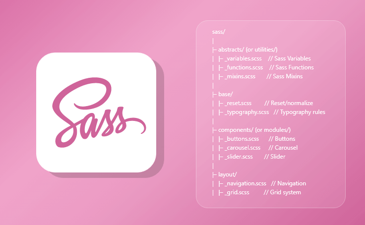
The SASS File structure pattern


[code language=”css”]
sass/
|
|– abstracts/ (or utilities/)
| |– _variables.scss // Sass Variables
| |– _functions.scss // Sass Functions
| |– _mixins.scss // Sass Mixins
|
|– base/
| |– _reset.scss // Reset/normalize
| |– _typography.scss // Typography rules
|
|– components/ (or modules/)
| |– _buttons.scss // Buttons
| |– _carousel.scss // Carousel
| |– _slider.scss // Slider
|
|– layout/
| |– _navigation.scss // Navigation
| |– _grid.scss // Grid system
| |– _header.scss // Header
| |– _footer.scss // Footer
| |– _sidebar.scss // Sidebar
| |– _forms.scss // Forms
|
|– pages/
| |– _home.scss // Home specific styles
| |– _about.scss // About specific styles
| |– _contact.scss // Contact specific styles
|
|– themes/
| |– _theme.scss // Default theme
| |– _admin.scss // Admin theme
|
|– vendors/
| |– _bootstrap.scss // Bootstrap
| |– _jquery-ui.scss // jQuery UI
|
`– main.scss // Main Sass file
[/code]

[code language=”css”]
@import ‘abstracts/variables’;
@import ‘abstracts/functions’;
@import ‘abstracts/mixins’;

@import ‘vendors/bootstrap’;
@import ‘vendors/jquery-ui’;

@import ‘base/reset’;
@import ‘base/typography’;

@import ‘layout/navigation’;
@import ‘layout/grid’;
@import ‘layout/header’;
@import ‘layout/footer’;
@import ‘layout/sidebar’;
@import ‘layout/forms’;

@import ‘components/buttons’;
@import ‘components/carousel’;
@import ‘components/slider’;

@import ‘pages/home’;
@import ‘pages/about’;
@import ‘pages/contact’;

@import ‘themes/theme’;
@import ‘themes/admin’;
[/code]

Reasons We Love SASS

1. Variables

  • Sass allows declaring variables that can be used  throughout the style sheet
  • Variables begin with $ and are declared like  properties
  • They can have any value that’s allowed for a CSS property, such as colors, numbers, or text

Veriable

Variables: SASS vs. SCSS

Variables Sass Scss

2. Mixins

Mixins allow re-using whole chunks of CSS, properties, or selectors

Mixins are defined using the “@mixin” directive, which takes a block of styles that can then be included in another selector using the “@include” directive

Mixins

Mixins: SASS vs. SCSS

Mixins Sass Scss

3. Nesting

  • Often in CSS, there are several selectors that  begin in the same way
  • Sass avoids repetition by nesting selectors  within one another

Nesting

Properties can be nested too

Nesting1

  • Pseudo-classes can be nested too (e.g.:hover)
  • Sass special character & in a selector & is replaced with the parent selector

Nesting: SASS vs. SCSS

Nesting Sass Scss

4. Imports

Style sheets can be big: the @import directive allows to break styles up into multiple style sheets

Import

5. Operator and functions

  • Operations (+, -, *, /, and %) are supported for numbers

There are many useful functions for colors, e.g.  To change lightness, hue, saturation,

Operator and functions

6. Selector Inheritance

Sass can tell one selector to inherit all the styles of another without duplicating the CSS properties

Selector Inheritance

Conclusion:

Organizing code is essential for developers and together with all other skills. It is the most effective way to improve the functioning of the site. And even though there are multiple ways of organization and different strategies, opting for simplicity helps you avoid dangerous pitfalls. And finally, there is no right or wrong choice since everything depends on the developer’s work strategies.

How To Use Flexbox In Web Projects

Flexbox is a powerful CSS feature that allows you to easily and efficiently manage the layout of your website. It makes it easy to create responsive designs, or even integrate dynamic resizing if you want. Flexbox is one of the most powerful CSS features for layout. It makes it easy to align elements, resize them appropriately and adapt to different screen sizes.

Why FlexBox

Flexible boxes, or Flexbox, is a new layout mode in CSS3.The Flexible Box Layout Module, makes it easier to design flexible responsive layout structure without using float or positioning. Use of Flexbox ensures that elements behave predictably when the page layout must accommodate different screen sizes and different display devices

It allows you to control the layout in a parent container. It offers some useful settings, which allow you to control the alignment of the items and to distribute the extra space. Flexbox is one-dimensional. That means it lays out its items in one dimension – either horizontally or vertically.

Benefits of CSS3 FlexBox

  • For many applications, the flexible box model provides an improvement over the block model in that it does not use floats
  • A “new” way of looking at responsive layouts
  • Makes “mobile first” layouts a breeze
  • page content can be laid out in any direction (to the left, to the right, downwards or even upwards)
  • bits of content can have their visual order reversed or rearranged
  • items can “flex” their sizes to respond to the available space and can be aligned
  • with respect to their container or each other
  • offer space distribution between items in an interface and powerful alignment capabilities

Basic Components and Terminologies

The CSS Flexbox specification describes a layout with items (flex-items) inside a container (flex-container). These items can grow or shrink in width and/or height, according to the available container space. The items “flex” to fit the parent container in the best possible way.

A flex container is declared by setting the display property of an element to either flex (rendered as a block) or inline-flex (rendered as inline). Inside a flex  container  there  is one or more flex items.

Everything outside a flex container and inside a flex items is rendered as usual.

Flex items are positioned inside a flex container along a flex line.Flexbox ComponetTo make an element a flex-container, set its display property to flex.

Display: flex

Example

Example1


HTML code

HTML

Result

HTML Result

Flex Direction Property

You can control the flow direction of flex items by defining flex-direction. This is done on the container level, not the item level.

  • row (default, horizontal, from left to right)
  • row-reverse (horizontal, from right to left)
  • column (vertical, from top to bottom)
  • column-reverse (vertical, from bottom to up)

When we did not specify flex-direction, it used the default value, which is row. For horizontal placement, but from the other direction, you can use row-reverse. For vertical, you can use either column or column-reverse.

Example (Row-reverse)

Row reverse

Row reverse1


Result


Row reverse Result

Example (Column)

Column

Column code


Result


Column Result

Example (Column-Reverse)

Column Reverse

Column Reverse code


Result


Column Reverse Result

Justify content (Horizontal Alignment property)

The justify-content property can be used not only for aligning items, but also for spreading items evenly across all the available space on the main axis.

The  possible  values  are  as  follows:

Flex-start – Default value. Items are positioned at the beginning of    the container

Flex-end – Items are positioned at the end of the container center – Items are positioned at the center of the container

Space-between – Items are positioned with space between the lines

Space-around – Items are positioned with space before, between, and after the lines

Example (Flex-end)

Flex end

Flex end code


Result


Flex end Result

Example (Flex-center)

Flex center

Flex center code


Result


Flex center result

Example (space-between)

Space between

Space between code


Result


Space between Result

Align Items Property (Vertical Alignment)

The align-items property vertically aligns the flexible container’s items when the items do not use all available space on the cross-axis

The possible values are as follows:

Stretch – Default value. Items are stretched to fit the container

Flex-start – Items are positioned at the top of  the container

Flex-end – Items are positioned at the bottom of the container

Center – Items are positioned at the center of the container (vertically)

Baseline – Items are positioned at the baseline of the container

Example (stretch)

Streach

Streach code


Result


Streach result

Example(Flex-start)

Flex start

Flex start code


Result


Flex start result

Example(Flex-end)

Eng Flex

Eng Flex

Result


Eng Flex Result

Example (center)

Example center

Example center code


Result


Example center Result

Flex-wrap property

The flex-wrap  property  specifies  whether the  flex  items should  wrap or not, if there is not enough room for them on one flex line

The possible values are as follows:

No wrap – Default value. The flexible items will not wrap wrap – The  flexible  items  will  wrap    if  necessary

Wrap-reverse – The flexible items will wrap, if necessary, in reverse order

Example (no wrap)

Nowarp

Nowarp code


Result


Nowarp code result

Example (wrap)

Wrap

Wrap code


Result


Wrap result

Flex item properties-Ordering

The  order  property  specifies the order of a flexible item relative to the rest of the flexible items inside the same container

Example (ordering)

Ordering

Ordering code


Result


Ordering result

Flex item Properties-Margin

Setting margin: auto; will absorb extra space it can be used to push flex items into different positions.

Example

Property Margin

Property Margin Code


Result


Property Margin Result

Setting margin: auto;  will  make the  item perfectly centered in both axis

Setting Margine

Setting Margine code


Result


Setting Margine result

Flex item property- Flex

The  flex   property  specifies the   length  of   the  flex  item, relative  to  the   rest     of  the  flex  items   inside the same container

Item Flex

CSS3 Flexbox  Properties (Summary)

  • Display- Specifies the type of box used for an HTML element
  • Flex-direction- Specifies the direction of the flexible items inside a flex container
  • Justify-content- Horizontally aligns the flex items when the items do not use all available space on the main-axis
  • Align-items- Vertically aligns the flex items when the items do not use all available space on the cross-axis
  • Flex-wrap- Specifies whether the flex items should wrap or not, if there is not enough room for them on one flex line
  • Align-content- Modifies the behavior of the flex-wrap property. It is similar to align-items, but instead of aligning flex items, it aligns flex lines
  • Flex-flow- A shorthand property for flex-direction and flex-wrap
  • Order- Specifies the order of a flexible item relative to the rest of the flex items inside the same container
  • Align-self- Used on flex items. Overrides the container’s align-items property
  • Flex- Specifies the length of a flex item, relative to the rest of the flex items inside the same container

Conclusion:

Flexbox is a powerful CSS layout method that makes responsive development easier. It’s easy to understand and use, especially once you’ve used it a few times. It’s perfect for any situation where you need to make elements more flexible, reorder elements, or create a responsive layout.

While working with Flexbox, it’s important to remember that you aren’t creating a layout from scratch. Instead, you are creating a layout from a single element. All the other elements will be resized and reordered around that central element.

If you are looking to create a responsive layout, or you have lots of content on a page, then it’s a good idea to use Flexbox. It will make your layout easier to create and it will resize as the screen size changes. For more information please consult with Andolasoft.

Organize Your Website With Advanced CSS Tricks

Developing a web doesn’t only follow the process of HTML, using CSS you can get an advanced web designing feature that gives you vertically centered content, dynamically sized elements, and night mode.

If you are thinking to shake up your website design, then learning CSS tricks can help you achieve it.

If you are working in the web industry, you might observe that you are following the same layouts and designing methods.

Many sites do not go with the trends. They follow the same 12 column grid, 2-3 colored layouts that have the same shapes. This makes the user feel bored.

So, you need to go beyond digital design. You can use print or editorial designs for the website.

The CSS advance properties provide you many benefits. CSS includes tools like CSS Grid, Flexbox that create an amazing layout. Using CSS you can get many visual styles.

CSS refers to Cascading Style Sheets that focus more on “Style”. To structure a web document such as defining paragraphs and headlines, embedding images, media, and video, for these features you use the HTML.

But to specify the style of documents such as colors, page layout, and fonts, CSS is used.

CSS Tricks

How does CSS help in organizing a website?

Using CSS you can add style to the page, through interaction with the elements of HTML.

Elements are the particular component of HTML in a web page.

With CSS you can create many innovations to your webpage layout. Such as:

  • Specify the font
  • Apply background colors
  • Contain boxes that hold webpage elements and these boxes float at a particular position of the page.

“Every dynamic application requires continuous support because there are so many components that make up a working software. There must be a system in place to support that.”          ― Nnamso Anthony

For example- a paragraph might appear in the HTML like this:

[code language=”css”]This is my Website! [/code]

To make this website appear in blue and bold for people to view your webpage through a web browser, you need to use the CSS tricks which make it convert into this

[code language=”css”]p {   color: blue; font-weight :bold;   }[/code]

In the CSS format, the selector was written at the left of the above curly bracket. The information in the curly bracket is known as the declaration; this consists of properties and values. This is applied to the selector.

This property provides features like color, size, and margins. The color and font are properties.

On the second statement:

[code language=”css”] p { color: blue; font-weight :bold; }[/code]

The bracket set p signifies the HTML paragraph is considered as the selector. The same principle is used to change the background colors, font size, and more.

“Routing is a key piece of every web application. At its heart, routing involves taking a URL, applying some pattern matching or other app-specific logic to it, and then, usually, displaying web content based on the result. Routing might be implemented in several ways: it’s sometimes code running on a server that maps a path to files on disk, or logic in a single-page app that waits for changes to the current location and creates a corresponding piece of DOM to display. While there is no one definitive standard, web developers have gravitated towards a common syntax for expressing URL routing patterns that share a lot in common with regular expressions, but with some domain-specific additions like tokens for matching path segments.” -JEFF POSNICK, “URLPattern brings routing to the web platform”

Never miss an update for us. Join 10,000+ marketers and leaders.

Advanced CSS Tricks to optimize your website:

To create a compatible and engaging website, you need to follow the advanced CSS tricks.  It is better to know the rules. It helps to keep things consistent.

Consistency can be applied for every possible way. Having a set of tricks reduces the pressure of mental overhead needed.

Here is some CSS trick that helps you to get better optimization on your web.

Mask:

If you want your assets in the browser to be partially visible or want to hide some of the elements, then you need to use this CSS feature.

Masking helps to build unique layouts and shapes.

It is done in three forms:

  1. Raster Image (ex: PNG format including transparency parts)
  2. SVG Elements
  3. CSS gradients

The SVG can be transformed or scaled without losing its quality

[code language=”css”]
img {

mask-image: url(‘mask.png’) linear-gradient(-45deg, rgba(0,0,0,1) 20%, rgba(0,0,0,0) 50%);

mask-image: url(#masking); /*referencing to the element generated and defined in SVG code*/

}
[/code]

Masking is one of the popular features, as it enables the use of these properties in background images.

Software and cathedrals are much the same – first we build them, then we pray.  – Bill Langley

SVG for animation:

SVG refers to Scalable Vector Graphics, which focus on scales. The SVG graphics are crisp irrespective of any resolution of the screen of your device, it is visible.

The SVG includes words that are kept in the tag <word>, this makes it easy to search, have access and select.

SVG with CSS is just like animating the other elements in the HTML. This can be done using transform, key frame animation, and transition features.

Using the SVG feature you can create any part that comes alive with these CSS tricks.

So these are some of the advanced CSS tricks you need to follow for organizing your website.

Vertical Alignment using Flexbox:

Vertical Alignment(Source – catswhocode)

Many front end developers often find it difficult to center a text or element vertically. But the CSS3 specialization, the display: flex value or property help to easily align any task or elements.

[code language=”css”]
<div class="align-vertically">
I am vertically centered!
</div>
[/code]

With display: flex you can specify a flexbox layout, by using align-items: center you can make the element vertical centering.

Horizontal Centering:

With three things you can horizontally center the block level elements in CSS. The first thing to follow is to explicitly set the element width; the next thing to do is to auto set the left and right margins.

With a proper doctype, you can keep the older version of the IE from going into quirks mode

[code language=”css”]
div#page {width: 960px; margin: 0 auto;}
[/code]

Using this you can center the div and id of the page present inside the parent container.

Fluid Images:

For creating a fluid image, the maximum width is to be set as 100%.

[code language=”css”]
img {max-width: 100%}
[/code]

As IE, doesn’t go with max-width, but IE treats the property of width ads it was the maximum width.
To set the IE maximum widths follow:

[code language=”css”]
img {width: 100%}
[/code]

Setting various classes on HTML Element:

To set multiple classes on HTML, you should follow:

[code language=”html”]
<div class= “class1 class-2 class-3”>
</div>

[/code]

Giving all the class names with a space between every class in the same set of double quotes.  This helps to control the CSS specificity by the order of the classes in your CSS file. However, if your CSS has

[code language=”css”]
class-2 {color: blue}
class-3 {color: green}
class 1 {color: red}
[/code]

Then your text present in the div is read as class-1 is to be declared at the end in the CSS. The order of the classes that show in the HTML is irrelevant.

CSS Specificity:

If two or more CSS selectors get conflicting instructions in a single html element, In such case you get a choice to do, you get to choose the styles you need. It is done using the CSS specificity calculations. It is expressed in the form of (a,b,c,d).

[code language=”css”]
element, pseudo element: d = 1 – (0,0,0,1)
class, pseudo class, attribute: c = 1 – (0,0,1,0)
id: b = 1 – (0,1,0,0)
inline Style: a = 1 – (1,0,0,0)
[/code]

Responsive CSS Grid:

Responsive CSS grid offers many ways of developing a customizable grid. It can be operated with equal or unequal column sizes.

[code language=”css”]

<div class="grid">
<div class="grid-item"></div>
</div>

.grid {
display: grid;
grid-template-rows: repeat(4, 1fr);
grid-auto-columns: calc((100vh – 3em) / 4);
grid-auto-flow: column;
grid-gap: 1em;
height: 100vh;
}

.grid-item:nth-child(3n) {
background-color: green;
}

.grid-item:nth-child(3n + 2) {
background-color: yellow;
}
[/code]

Change the z-index stacking order with opaque:

If you have 3 divs, if each placed absolutely, contains another element when increasing to z-index number. The next one of each div appears at the top.

If you are adding z index: 10 at the first one, this will appear at the top of the other two. It remains in order as before.

If you add “opacity: 0.99” to the first div and soon you will see it get stacked under the other two.

I’ve worked with the team at AndolaSoft on multiple websites. They are professional, responsive, & easy to work with. I’ve had great experiences & would recommend their services to anyone.

Ruthie Miller, Sr. Mktg. Specialist

Salesforce, Houston, Texas

LEARN MORE

Conclusion

All the CSS tricks used share some common features. It maximizes the use of CSS as a styling language.

It provides better results for your website. Using CSS features you can get better performance and provide a better experience to users.

With the help of these properties and values you can easily set the best feature in your website layout.

Are you looking to develop a best feature website layout with advanced CSS! Lets discuss