In an era where mobile devices are our constant companions, ensuring your WordPress website is mobile-optimized has become a priority for website owners and developers.
With mobile users constituting a substantial portion of web traffic, the seamless functioning and accessibility of your website on smartphones and tablets are pivotal for maintaining user engagement, boosting search engine rankings, and driving overall success.
In this comprehensive guide, we will dive deep into each step required to effectively mobile-optimize your WordPress site, allowing you to tap into the ever-expanding mobile audience with confidence.
Step-by-Step Mobile Optimization Guide
-
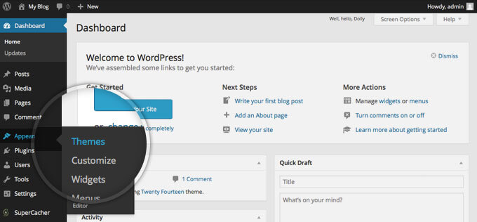
Choose a Responsive Theme
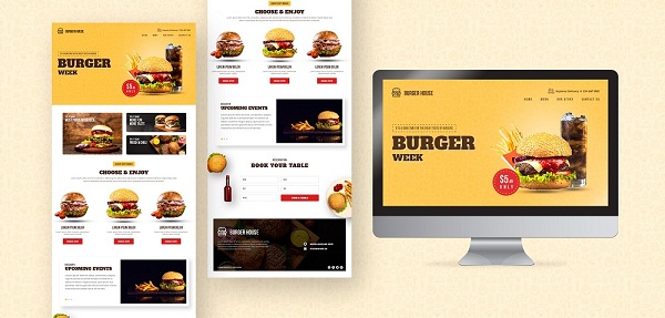
Responsive design lies at the core of mobile optimization. Opt for a WordPress theme that is explicitly labeled as “responsive.”
Such themes are built to adapt automatically to various screen sizes and orientations, ensuring your website’s layout remains coherent and user-friendly across all devices.
Responsive themes eliminate the need for creating separate mobile versions of your site, streamlining your design efforts and providing a consistent user experience.
When selecting a theme, preview it on different devices to ensure that all elements display correctly and intuitively. You can also develop your custom theme by hiring a professional WordPress theme development company.
Top 10 Responsive WordPress Theme
- Divi
Divi is a versatile and highly customizable theme that comes with a built-in drag-and-drop builder, making it easy to create unique layouts without coding skills. - Astra
Astra is known for its speed and flexibility. It’s lightweight and offers many customization options to create a visually appealing and responsive site. - OceanWP
OceanWP is a multipurpose theme with a focus on performance and SEO optimization. It provides a range of pre-built templates suitable for various niches. - Neve
Neve is another lightweight theme that’s great for performance. It offers a simple design and compatibility with popular page builders. - Hestia
Hestia is a modern one-page theme that’s perfect for startups and small businesses. It’s compatible with WooCommerce, making it suitable for e-commerce as well. - GeneratePress
GeneratePress is a fast and lightweight theme with a minimalistic design. It’s highly customizable and works well with various page builders. - Enfold
Enfold is a multipurpose theme with a strong focus on design and versatility. It comes with a variety of pre-designed layouts to choose from. - Avada
Avada is one of the best-selling themes on ThemeForest. It offers a wide range of customization options and pre-built templates for different industries. - Soledad
Soledad is a popular choice for blogs and magazines. It offers numerous layout options and styles to create visually appealing content. - Salient
Salient is a visually striking theme with a focus on creative designs. It’s suitable for portfolios, agencies, and other creative websites.
-
Optimized Images

Images are essential for visual appeal, but they can significantly impact loading times on mobile devices if not optimized.
Compress and resize images before uploading them to your site to minimize their file size while maintaining visual quality.
Plugins like WP Smush and EWWW Image Optimizer can assist in automating this process.
Alternatively, consider using the “lazy loading” technique, which loads images only when they come into the user’s view, further enhancing performance.
Top 10 Tips to Optimize Images
- Choose the Right Format:
Select the appropriate image format based on the type of image. Use JPEG for photographs and images with many colors, PNG for images with transparency or simple graphics, and WebP for modern browsers that support it. - Resize Images:
Resize images to the dimensions they will be displayed on your website. Avoid uploading large images and relying on HTML or CSS to scale them down, as this can slow down loading times. - Compress Images:
Use image compression tools or plugins to reduce the file size while maintaining acceptable quality. Compressed images load faster without sacrificing visual appeal. - Optimize for Web:
When exporting or saving images in image editing software, choose the “Save for Web” option. This ensures unnecessary metadata is stripped and the image is optimized for online use. - Use Image Compression Tools:
Utilize online image compression tools like TinyPNG, ImageOptim, or io to further reduce image file sizes without compromising quality. - Lazy Loading:
Implement lazy loading for images, which loads images as users scroll down the page. This technique prioritizes above-the-fold content, improving initial loading times. - Responsive Images:
Use the srcset attribute to provide different image sizes for different screen resolutions. This ensures that users on various devices receive appropriately sized images, reducing unnecessary data transfer. - Use CDN:
Consider using a Content Delivery Network (CDN) to serve images from servers closer to the user’s location. CDNs improve loading times by reducing latency. - Optimize Alt Text:
Include descriptive and relevant alt text for images. Alt text not only improves accessibility but also helps search engines understand the content of the image. - Minimize Decorative Images:
Reduce the use of decorative images that don’t provide meaningful content. Use CSS for simple design elements, reducing the need for additional image requests.
-
Streamline Content

Content plays a vital role in mobile optimization. However, the constraints of smaller screens require strategic content presentation.
Condense lengthy paragraphs, prioritize essential information, and break down content into easily digestible sections.
Utilize subheadings, bullet points, and shorter paragraphs to enhance readability.
Keep in mind that mobile users often have limited time and attention, so ensure your content is scannable and engaging.
Top 10 Tips to Optimize Content For Mobile User
- Keep it Concise:
Mobile users have limited attention spans. Write succinctly, conveying your message in fewer words while maintaining clarity and impact. - Use Short Paragraphs:
Break content into short paragraphs to enhance readability. Long blocks of text can be daunting on mobile screens. - Use Subheadings:
Utilize descriptive subheadings to guide users through your content. Subheadings break up the text and make it easier for users to find relevant information. - Prioritize Important Information:
Place the most critical information at the beginning of your content. Mobile users often skim, so ensure that key points are easily accessible. - Use Bullet Points and Lists:
Organize information using bullet points and lists. This format simplifies complex content and makes it easier to digest on mobile devices. - Avoid Jargon:
Write in plain language, avoiding technical jargon that might confuse mobile users. Keep your tone conversational and relatable. - Optimize Font Size:
Choose a font size that is legible on smaller screens. Aim for a font size of around 16px for body text to ensure easy reading. - Contrast for Readability:
Ensure sufficient contrast between text and background to enhance readability, especially in various lighting conditions. - Minimize Hyperlinks:
Reduce the number of hyperlinks in your content. Mobile users might find it challenging to accurately tap on small links. - Use Responsive Design:
Ensure that your website uses responsive design, which automatically adjusts the layout and font size to fit different screen sizes. This guarantees a consistent reading experience across devices.
-
Implement Mobile-Friendly Fonts

Font selection contributes to both aesthetics and readability. Opt for legible fonts that render well on various screen sizes.
Avoid using fonts that are too small, as they can strain users’ eyes and deter them from engaging with your content.
Consider fonts specifically designed for digital interfaces, as they are optimized for both readability and mobile screens.
Test different fonts to find the right balance between style and usability.
Top 10 Tips To Implement Mobile Friendly Fonts
- Choose Legible Fonts:
Opt for fonts that are easy to read on smaller screens. Prioritize clarity over elaborate or intricate fonts that may become unclear on mobile devices. - Responsive Design:
Use responsive design techniques to ensure that fonts adjust appropriately to different screen sizes and orientations. - Font Size Matters:
Select an appropriate font size for mobile screens. Aim for a font size of around 16px for body text to maintain readability. - Contrast for Readability:
Ensure there is sufficient contrast between the font colour and the background to enhance legibility, especially in varying lighting conditions. - Limit Font Variations:
Avoid using too many different fonts. Stick to a cohesive font palette that compliments your website’s design. - Use Web-Safe Fonts:
Opt for web-safe fonts that are universally available across devices and browsers. This ensures consistent display regardless of the user’s device. - Consider Loading Speed:
Choose fonts that won’t significantly impact your website’s loading speed. Heavy or complex fonts can slow down mobile browsing. - Avoid Tiny Fonts:
Steer clear of overly small font sizes, as they can strain mobile users’ eyes and discourage reading. Aim for fonts that are comfortably readable. - Test on Various Devices:
Ensure your selected fonts display correctly and legibly on a range of mobile devices and screen sizes to guarantee a consistent user experience. - Accessibility Considerations: Keep accessibility in mind. Use fonts that are compatible with screen readers and ensure sufficient contrast for users with visual impairments.
-
Optimize Pop-Ups

While pop-ups can be effective for capturing user information, intrusive ones can disrupt the mobile user experience.
Ensure that pop-ups do not cover the main content or make it difficult to close them on small screens.
Consider using alternatives such as banners, slide-ins, or timed pop-ups that offer value without hindering the browsing experience.
User experience should always take precedence over aggressive marketing tactics.
Top 10 Tips To Optimize Pop-Ups for Mobile Devices
- Mobile Responsiveness:
Ensure that your pop-ups are designed to be responsive, adapting seamlessly to different screen sizes and orientations. - Size and Placement:
Keep pop-up sizes manageable and avoid full-screen pop-ups. Place them strategically so they don’t cover important content or navigation elements. - Clear Call to Action (CTA):
Craft concise and compelling CTAs that clearly communicate the value of the offer or action users should take. - Minimalistic Design:
Opt for simple and clean designs that load quickly on mobile devices. Avoid excessive visuals that could slow down loading times. - Easy Close Option:
Make it effortless for users to close the pop-up. Include a prominent close button that’s easy to tap, enhancing user satisfaction. - Delayed Display:
Implement delayed pop-up triggers to allow users a moment to engage with your content before encountering the pop-up. - Exit-Intent Technology:
Use exit-intent pop-ups that appear when a user is about to leave the page. This provides one last opportunity to engage without disrupting the user’s experience. - Frequency Control:
Limit the frequency of pop-ups to avoid overwhelming users with repetitive messages. Consider showing them only once per session. - Testing and Analytics:
Regularly test your pop-ups on different mobile devices and browsers. Monitor analytics to assess user interaction and optimize performance. - Offer Value:
Ensure your pop-up offers provide genuine value to users. Offering discounts, exclusive content, or useful resources can encourage positive engagement.
-
Simplify Navigation

Navigation is a cornerstone of user experience, especially on mobile devices. Create a mobile menu that is intuitive, easily accessible, and efficiently organized.
One common approach is to implement a hamburger menu, which condenses navigation options into a collapsible icon, saving valuable screen real estate.
Keep the menu concise by prioritizing essential pages and simplifying navigation paths.
Also, ensure that users can easily return to the homepage from any point within your site.
Top 10 Tips to Optimize Navigation for Mobile Devices
- Streamline Menu Items:
Condense your navigation menu to the most essential items. Aim for a concise menu that fits well on smaller screens. - Use Hamburger Menu:
Implement a hamburger icon (three horizontal lines) to house menu items. This icon conserves space and offers a familiar mobile navigation pattern. - Prioritize Content: Place the most important menu items at the top of the navigation. Users shouldn’t have to scroll extensively to access critical sections.
- Avoid Dropdown Menus: Minimize or eliminate dropdown menus as they can be challenging to interact with on mobile devices. Opt for straightforward navigation.
- Clear Labels: Use concise and descriptive labels for menu items. Users should immediately understand the purpose of each link.
- Thumb-Friendly Design: Arrange menu items in a way that makes them easily tappable with the thumb. Avoid placing links too close together.
- Search Bar Visibility: Ensure the search bar is easily accessible for users seeking specific content. Consider a prominent search icon that expands when clicked.
- Use Icons Sparingly: Implement icons alongside text labels for visual cues. However, avoid overwhelming users with too many icons, which can lead to confusion.
- Sticky Navigation: Consider a sticky navigation bar that stays fixed at the top of the screen as users scroll. This keeps essential links readily available.
- Testing and Optimization: Regularly test your mobile navigation across various devices to ensure it’s intuitive and responsive. Analyze user behavior to identify areas for improvement.
-
Ensure Touch-Friendly Buttons

Mobile devices rely on touch interactions, making it crucial to design buttons that are touch-friendly.
Buttons should be adequately sized to accommodate tapping without accidental clicks on nearby elements.
Additionally, ensure there is sufficient spacing between buttons to prevent user frustration.
Using contrasting colors and incorporating visual feedback, such as button highlighting upon touch, enhances the overall user experience.
Test the responsiveness of buttons on various devices to ensure consistent functionality.
Top 10 Tips to Optimize Buttons for Mobile Devices
- Size and Tapability:
Ensure buttons are of an adequate size for easy tapping. Aim for a minimum touch target size of around 44×44 pixels to accommodate different finger sizes. - Ample Spacing:
Place buttons with enough space around them to prevent accidental clicks on neighboring elements. This reduces user frustration. - Clear Labeling:
Use concise and descriptive labels on buttons. Users should immediately understand the purpose of the button without ambiguity. - Contrast and Visibility:
Choose button colors that provide good contrast against the background. This ensures visibility and readability, especially in varying lighting conditions. - Finger-Friendly Shape:
Opt for rounded or slightly curved button corners. Sharp corners can be difficult to tap accurately on mobile screens. - Consistent Styling:
Maintain consistent button styling throughout your website. Consistency aids recognition and builds user familiarity. - Easy-to-Find Placement:
Place buttons in easily accessible locations, typically within the user’s natural thumb reach, to enhance ease of interaction. - Hierarchy and Priority:
Differentiate buttons based on their importance. Make primary actions more prominent and easily distinguishable from secondary ones. - Loading Speed:
Ensure button graphics or icons are lightweight to minimize loading times. Slow-loading buttons can negatively impact user experience. - Testing and Feedback:
Regularly test buttons on different devices and screen sizes. Seek user feedback to identify any challenges they might face while interacting with buttons.
-
Test, Test, Test
Thorough testing is pivotal in mobile optimization.
Regularly evaluate your website on a range of devices, including smartphones and tablets of different screen sizes and orientations.
Testing helps you identify potential issues such as broken elements, misaligned content, or slow loading times that might be detrimental to user experience.
Emulate real-world scenarios by simulating various user interactions and scenarios, including scrolling, tapping, and navigating through your site.
By continually testing and refining, you can provide a seamless experience across diverse devices.
-
Leverage Accelerated Mobile Pages (AMP)

Accelerated Mobile Pages (AMP) is an open-source initiative aimed at creating faster-loading web pages for mobile users.
By implementing AMP, you create stripped-down versions of your pages that load almost instantaneously on mobile devices.
Are you looking for a WordPress developer
AMP significantly improves mobile loading speed, enhances user engagement, and positively impacts search engine rankings.
Many WordPress plugins are available to facilitate the implementation of AMP on your website.
-
Monitor Performance
Mobile optimization is an ongoing process that requires vigilance. Utilize tools like Google PageSpeed Insights and GTmetrix to assess your site’s performance regularly. These tools provide insights into loading times, performance metrics, and suggestions for improvement.
Analyze your site’s mobile performance data, identifying bottlenecks and areas that need optimization. By addressing these issues promptly, you ensure that your site remains fast, user-friendly, and aligned with modern mobile standards.
FAQs
- FAQ: Why is mobile optimization important for my WordPress website?
Answer: Mobile optimization ensures your website provides a seamless and user-friendly experience on smartphones and tablets, improving user engagement and search engine rankings.
- FAQ: What is the impact of page load speed on mobile optimization?
Answer: Page load speed greatly affects mobile user experience. Optimize images, use caching plugins, minimize code, and reduce server response time to enhance loading times.
- FAQ: Are there plugins specifically for mobile optimization?
Answer: Yes, there are plugins like WPtouch and Jetpack that offer mobile optimization features such as responsive design, mobile themes, and performance enhancements.
- FAQ: Should I use a separate mobile site or responsive design?
Answer: Responsive design is recommended as it maintains a consistent experience across all devices, eliminating the need for managing multiple sites.
- FAQ: How can I test my WordPress site’s mobile optimization?
Answer: Use tools like Google’s Mobile-Friendly Test and PageSpeed Insights to evaluate your site’s mobile performance. Additionally, test your site on actual devices to ensure a smooth experience.
Final Thoughts
Mobile optimization is more than a trend – it’s a necessity for any website aiming to provide a satisfying user experience.
By following these step-by-step guidelines, you’ll be well-equipped to not only meet the expectations of your mobile audience but also boost your site’s visibility, engagement, and overall success.
As mobile technology continues to evolve, your commitment to mobile optimization will be instrumental in keeping your WordPress site ahead of the curve and accessible to users no matter where they are or what device they’re using.